
Overview
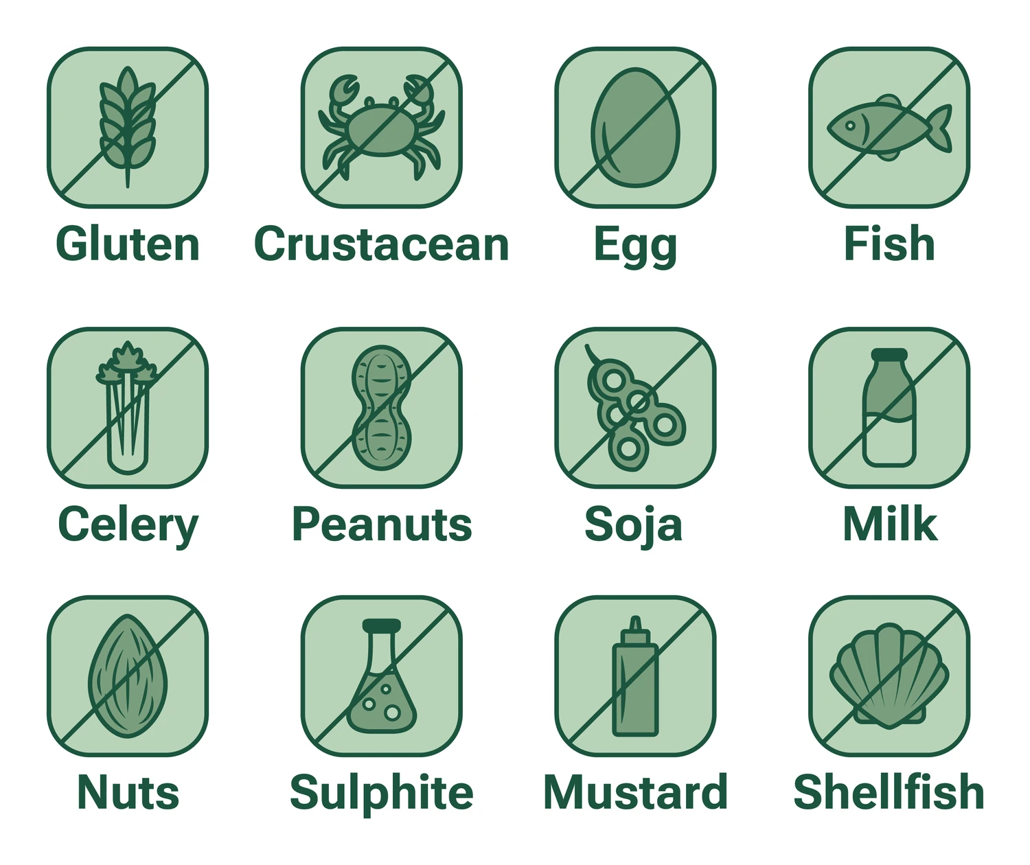
SafePlate is a food brand for people with severe allergies. The identity combines three core values: safety, clarity and enjoyment. It gives its audience back their confidence when eating, through controlled ingredient lists and a consistent allergen icon system on every pack.
Challenge
People with complex allergies spend a lot of time reading labels and comparing ingredients. Eating becomes a burden. The brand had to inform without lecturing, protect without patronising, and communicate safety without feeling clinical.
Approach
The logo mark is a plate in the shape of a shield, trust through form. The tone is calm and factual, without exaggeration or empty promises. The language is simple and direct. A reduced natural palette of greens anchors the brand visually between food and reliability.
Corporate Behavior
Tone: clear, calm, factual. Language: simple sentences, no jargon. Transparency: all contents communicated openly and understood at a glance. Reliability: every pack follows the same system. Attitude: empathetic, never pitying. SafePlate treats its audience as competent people.




Palette
Typography
- RobotoPrimary / Wordmark + HeadlinesLight, Regular, Bold
- InterBody / UILight, Regular, Medium, Bold
Outcome
A brand that makes safety a matter of course. Consistency is not only aesthetic here, it is functionally central.